
CHAPTER 03 · TOPIC 02
Screening Tests and ROC Curves
Learn 2×2 diagnostic tables, sensitivity, specificity, predictive values, ROC curves, AUC, and clinically appropriate thresholds.
On this page
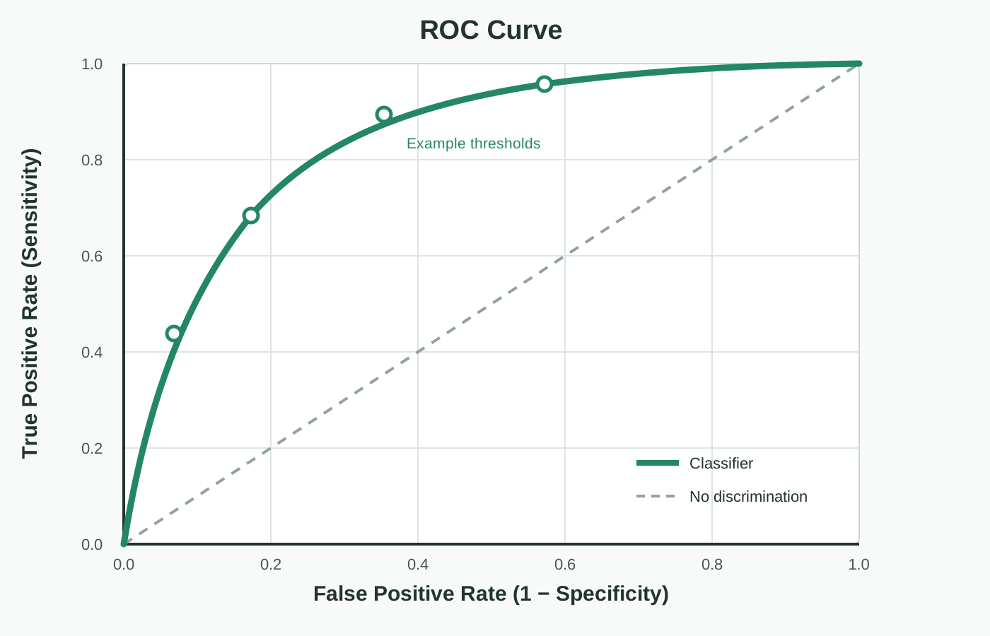
Screening tests temporarily divide subjects into groups with a high probability of developing the disease and those with a low probability of developing the disease, depending on the test results. An ROC curve shows test performance at different decision thresholds in one diagram. You can interpret each point on the ROC curve by first understanding the 2x2 table, sensitivity, and specificity.
2x2 table of test results#
| Test results/disease status | Disease + | No disease (Disease −) |
| Test positive (Test +) | True positive TP | False positive FP |
| Test negative (Test −) | False negative FN | True negative TN |
| Abbreviation | Term | Meaning |
| TP | True Positive | I have a disease and test positive |
| FP | False Positive | No disease but positive test |
| FN | False Negative | Have a disease but test negative |
| TN | True Negative | No disease and negative test |
Sensitivity and specificity#
Sensitivity is the proportion of people who truly have the disease that the test detects, and specificity is the proportion of people who do not have the disease that it correctly excludes. Since the denominators are different, first check which group you are calculating within.
Positive predictive value and negative predictive value#
In clinical practice, we work backwards from the test results to ask what proportion of positive people actually have the disease and what proportion of negative people actually do not have the disease. This is the positive predictive value and negative predictive value. Because both are affected by prevalence, PPV and NPV from one study cannot be directly applied to all populations.
Why do we need a threshold?#
In order to convert continuous values such as blood pressure, blood sugar, tumor markers, and predictive scores into positive and negative values, it is necessary to define a threshold/cutoff.
How do you create an ROC curve?#
Try multiple thresholds in turn and calculate the sensitivity and specificity of each. The horizontal axis is the false positive rate 1−specificity, and the vertical axis is the sensitivity. Connecting each coordinate creates an ROC curve.
| Position | Meaning |
| bottom left (0,0) | Almost all negative: Few false positives, but no cases found |
| Top right (1,1) | Almost everyone is positive: cases are found, but there are many false positives |
| Top left (0,1) | Ideal classification with sensitivity 1 and false positive rate 0 |
| Near the diagonal | Discrimination ability is close to random classification |
What does AUC represent?#
AUC is the area under the ROC curve and summarizes the ability to distinguish between disease and no disease. The closer it is to 1, the higher the discriminatory ability, and the closer it is to 0.5, the closer the ranking ability is to random.
How to choose a threshold?#
If you value sensitivity and specificity equally, you could consider the point closest to the top left or the point with the highest Youden index. However, if the losses due to false negatives and false positives are different, the clinical purpose will take precedence.
| Symbol | Meaning |
| TP、FP、FN、TN | true positive, false positive, false negative, true negative |
| TPR | True positive rate = sensitivity |
| FPR | False positive rate = 1 - specificity |
| PPV、NPV | Positive predictive value, negative predictive value |
| threshold/cutoff | Boundary that separates continuous values into positive and negative |
| AUC | Area under the ROC curve. Overall discrimination ability |